Friday, December 29, 2006

Don't They Know It's The End of the World?


So yeah, I feel bad about recommending the first issue of Howard Chaykin's Guy Gardner: Collateral Damage so highly. Because as good as the first issue was, the second issue... wasn't. It's almost as if, halfway through the project, he realized he was doing a freakin' Guy Gardner book and then decided to get the whole thing done in one mad No-Doze fueled weekend. Because all the good exposition and set-up in the first issue really didn't have nnaything to do with what actually happened. And as for what actually happened? I'm not really sure. There was a lot of yelling, and some really horrible Liefeld-esque anatomy, and plot points out of left field. Just bad.

There was one line that got a real, honest-to-God laugh out of me, however. I won't give the joke away if you haven't read it yet, but "Hey - thanks for your support" was almost worth the price of admission in and of itself.


If you know me at all, you know there are a few things for which I am unabashed sucker. One of these things is Quasar (who should be getting resurrected any minute now). Another of these things is, sadly, Secret Wars. Yeah, I know, it doesn't exactly speak highly of me.

But yes, Beyond! kicked all kinds of ass. Not only was it sort-of a sequel to the first Secret Wars, but it also had some of my favorite b- and c-list characters featured prominently. Hank Pym and the luscious Wasp? Check. Deathlok II, Michael Collins? Check. The Space Phantom? Check. Xemnu the Titan That's a Ten-Four, good buddy.

Dwayne MacDuffie gets props not only for taking some cool characters and using them well, but for using some frankly lame characters in such a way as to make them, well, maybe not interesting, but at least sensible in the context of the book. I mean, the Hood and Al Kraven? Not exactly any Marvel Zombie's favorite characters, and yet MacDuffie used them in such a way as it made perfect sense for them to be there, and furthered the characters in such a way as any future writer could easily pick them up for their own purposes. You know, like how writers used to apply the shared universe concept, before it became a bunch of semi-autonomous feifdoms where each writer had their own pet characters whom they use to the exclusion of all others...

Anyway, I did have a couple nitpicks, but they were small. First, the original Battleworld took place in a barren galaxy, so all the stars and moons in the sky were slightly distracting, if this was indeed supposed to be the OG Battleworld. Second, I have a hard time believing that the person pretending to be the Beyonder (I won't give that away) wouldn't have seen through the deception at the end of the book... but I'll accept that since it was the end of the series there needed to be an ending. Otherwise, MacDuffie did a great job of following through on the logic of his premise. Although, I have to ask, what happened to Dragon Man, Xemnu and Northstar? How did they get off the planet? Inquiring minds want to know!

Wednesday, December 27, 2006


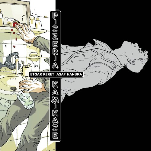
Pizzeria Kamikaze
by Etgar Keret & Asaf Hanuka


The question of just how my reviews are perceived by the people who read this blog is something which I'll admit takes up a bit more of my thinking time than it probably should. I end up writing a lot of positive reviews, and I'd be lying if I said that didn't occasionally worry me, in a weird way. For some odd reason we've got this critical system where a negative review is granted far more weight than a positive one, and a critic's gravitas is often measured, either directly or indirectly, by the articulate negativity which they can bring to bear on their subjects.

It's all bullshit, of course. But that doesn't mean that the prejudices aren't still there in the back of a person's mind. I worry about whether or not all these positive reviews have the effect of lowering my esteem in the critical community (as if there is such a thing as "esteem" in such a community - hah!); whether or not a genuine enthusiasm for the subject can be seen by some as a sign of an undiscerning intelligence, a weakly developed aesthetic sense, or just plain old bad taste. There are, of course, much more important things to be worrying about, but you could probably make a good argument for the idea that if I had better things to worry about I wouldn't be blogging in the first place.

Which brings us, in a roundabout way (is there any other kind?) to Pizzeria Kamikaze, recently published by Alternative Comics. It is pure coincidence that Pizzeria Kamikaze was next in my to-read pile after The Placebo Man, despite the fact that the latter was by Tomer Hanuka and the former is the product of his brother, Asaf. Reading both books within the span of just a couple days, I was left with an undeniably disquieting feeling of awe, that two such incredibly talented cartoonists could have come from the same lineage. It's not without precedent, obviously: I'm not going to put the Hanuka brothers up there with Los Bros Hernandez anytime soon. But in all seriousness, if they continue to apply themselves to the medium with the same conscientiousness they have the potential to be among the very best creators of their generation.

Pizzeria Kamikaze is, if anything, even more impressive than The Placebo Man. Part of the charm of Tomer's volume was seeing the artist come into his talent, emerging from early experiments and misfires into a fully-formed cohesive creative vision. But there's nothing tentative about Pizzeria Kamikaze. It probably helps in this respect that Kamikaze is actually an adaptation, in this case of Etgar Keret's novel Kneller's Happy Campers. I've never read any of Keret's work before, but the promotional material describes him as "the Amos Oz of his generation" - high praise, I suppose (although we can hope that if Keret's work is any good he will find a larger audience outside Israel than Oz has ever managed).

The result is, in any event, one of the most gratifying literary adaptations I've ever seen in the comics medium. The story begins with a suicide, that is, Mordecai's suicide - after which he finds himself working at a pizzeria somewhere in purgatory. Or rather, a purgatory populated exclusively with the ghosts of fellow suicides. It's very much like earth, only maybe a little more drab in places, and people often have conspicuous exit wounds or massive scarring on their wrists. (Mordecai took pills, so he arrives in the afterlife in pristine condition.) After a while shoveling pizzas out of the oven, he runs into an acquaintance who informs him that his girlfriend from earth killed herself not long after Mordecai did, inspiring him to set off across the countryside to find her.

More than anything else, Pizzeria Kamikaze reminded me of Albert Brooks' Defending Your Life*. Although the two works are dissimilar in tone -- with Pizzeria Kamikaze coming off slightly ominous and spooky next to the arch satire of Brooks' film -- both share essentially the same droll premise. The afterlife is very much like life, only maybe a bit more banal. In place of pearly gates and heavenly choirs, there are bureaucrats and supermarkets. The overwhelming sensation is chagrin, like the very concept of death is nothing but a Pet Shop Boys concept album.

Mordecai's quest, such as it is, is a nonstarter from the beginning, and on some level the reader acknowledges this long before the characters. The very notion of a quest seems on some level to be at odds with the aggressively unspectacular nature of the gray afterlife in which these people have found themselves. They're in perpetual stasis. The question is not whether they will find a solution to their dilemma; the question is whether they will move past the notion of dilemmas and solutions. This is illustrated most succinctly in a scene where Mordecai and a companion - both Israeli nationals - find themselves in an Arab bar populated by "retired" suicide bombers. The Israelis don't so much as elicit a shrug from the Arab patrons: obviously, they didn't get their 70 virgins. Like most everyone else in this strange afterlife, they're possessed of nothing so much as a keenly developed sense of sang-froid.

Hanuka's style owes a lot to the stolid, understated draftsmanship of mainstream artists like Sean Phillips. There isn't a lot of narrative flash on display here: like the story itself, the events unfold with a casual precision, anecdote following anecdote in an assured progression. It's an easy rhythm that pulls the reader through the book at a brisk clip. The book is printed in two-tone, with black and silver ink. The result is not dissimilar to Ben Katchor's use of a limited color palette to evoke curdled nostalgia: the silvery graytones lend an air of pallid enervation.

More than anything, I came away from Pizzeria Kamikaze thoroughly impressed, fully seduced by the emotional delicacy of Keret's vision and the subtlety with which Hanuka's deceptively simple illustration brought this vision to life. I haven't really been paying attention to all the year-end lists which seem to be popping up like mushrooms - I have a strong aversion to them** - but if I were to compose my own (biased, personal) list, Pizzeria Kamikaze would be pretty high***. It's a fairly modest story, but it succeeds so completely in selling its distinctive reality that the effect is nothing short of intoxicating.


* Brooks' last great film. I forced myself to sit through Searching for Comedy in the Muslim World recently - now that was a physically painful experience.

**In case you were wondering, yes, I did participate in Popmatters year-end critics' poll. No, I wasn't very happy with the final list, but that's the nature of such lists to begin with. It's a necessary evil, I suppose - everyone gets a kick out of those lists, except the people who actually have to make them. They usually just piss me off.

***Not as high as Brian Chippendale's Ninja, however. Still haven't read Fun Home but it's sitting on my coffee table as I write this.

Monday, December 25, 2006

Sunday, December 24, 2006

Joy to the World


Why do I get the feeling that not too many people are going to be interested in reading heavy content for the next few days? Just a hunch, I heard tell of some sort of holiday this Monday; no one ever tells me these things, I think I missed a memo. All I know is that I already got my presents for this year - or rather, I got a couple semi-nice things for myself and a package from my parents as well. And my grandmother sent me some really expensive Swiss cheese; the kind of gift you probably don't respect very much until you actually realize that the expensive Swiss cheese is really fucking good.

Anyway, in honor of the birth of our Lord and Savior, here's a recent article of mine on atheism. If you thought I was a curmudgeon on the subject of comics, just wait until you hear me on religion. Also, not really apropos of the season, here's my list of the ten best electronic music releases of 2006. Good stuff, a splendid time was had by all.

Friday, December 22, 2006

A Marxist Interpretation of Richie Rich


The holidays are seen by many in the bourgeois moneyed classes as an occasion for charitable giving -- a weak sop to their vestigial conscience that actually masks a despicable reinforcing of class distinction. The act of charitable giving on the part of the wealthy is a fundamental affront to the dignity of the poor and working classes, a demeaning exercise in the flaunting of conspicuous largess as a way of adding feeble moral support to a decaying system of class-based material imbalance and inefficient resource management.

The butler's act of seemingly spontaneous charity is doubly shaming -- certainly if anyone can sympathize with the plight of the homeless, it's the man whose job forces him to demean himself at the alter of criminally ostentatious wealth. One day Richie Rich's small, pudgy body will be found in the gutter, having been garroted and violated by a rising tide of righteous indignation. His mewling pink baby flesh, unconditioned to any kind of physical labor above the level of pushing a button to summon a servant, will be dragged through the streets as symbol of man's triumphant freedom from economic oppression.

Thursday, December 21, 2006

Bah! Humbug!


There is no worse feeling in the world than trying to rewrite something you already wrote. It's like walking uphill with cinderblocks strapped to your feet -- one of those things that you don't want to do, and will resist for as long as possible. That review I mentioned yesterday? It's still gone, and I am procrastinating rewriting it. Since no one ever posts a comment to the reviews, I'm sure that means you're all just too stunned by the greatness of my intellectual heft to say anything. I get many, many more responses whenever I throw out some off-the-cuff references to bad superhero comics than for the reviews which I painstakingly assemble for seemingly no-one's benefit but my own. Perhaps I should just stick to posting old ALF covers? That's a good old standby.


This is a fun cover that highlights one of the most prominent devices in the ALF comic world (as well as the two short-lived ALF animated series), i.e. spoofing pop culture by creating a "Melmac" surrogate (Melmac was ALF's home planet). Just on the cover here you've got the Melmacian X-Men (the X-Melmen, complete with a Michigan Wolverine) a Melmacian Marx Brothers, and a Melmacian viking (I really don't remember) -- in addition to ALF's alter-egos as the super-heroic Fantastic Fur and sports mascot the Crazy Critter. That's quite a lot of permutations for one character, and it's conceivable that had the series ran longer they could have kept it up. It would have been nice to see a Melmacian spoof of Titanic.

And incidentally, what do you think the audience for ALF really was, if they could successfully spoof the Marx Brothers? How many kids do you know who sit around watching Duck Soup, or even know who Groucho is enough to get the joke in the first place? I think this is another instance of comic creators' cultural literacy coming out in odd, and arguably inappropriate places. There's a certain type of comics writer (mostly active in the 70s and 80s, but there were still a few into the 90s) who liked to pepper their mainstream superhero work with references to totally obscure (or just antiquated) pop culture references that could only go totally over the heads of the presumed target audience -- and that's even if you assumed the target audience was older than kids and preteens. I can't think of any instances off the top of my head, but it was pretty common for a while, and I always imagined that kind of stuff must have confused kids more than anything else.


I used to hate Kid Rock. There was something about his proudly ignorant, self-satisfied white-trash persona that rubbed me all kinds of the wrong way. His music was disgusting. He was not above championing his own tastes in the press, and invariably they were lousy. And he never, ever seemed to wear a shirt, at least back in the day, and he most certainly did not have the kind of physique that could in any way carry off shirtlessness.

But I see now that my hatred for the Kid was nothing, merely a little schoolgirl crush, compared to my deep and abiding loathing for Nickelback. Just the sound of Chad Kroeger's voice is enough to send me into spasms of fury. At the same time, the music itself is so despicably smooth, so unconditionally populist in appeal, that it can't help but worm its way into your brain, much like a hideous brain gremlin.

When I tune in to watch Doctor Who on Sci Fi every week, they invariably run a ton of promos for Battlestar: Galactica. And for some reason they decided that the music they needed to use to promote that show was Nickelback, in particular this one twenty-or-so second loop of whatever their latest "hit" is. This same loop that has been bouncing in and out of my head for months, like some sort of early-onset senile dementia in the form of a recurring aural motif. You ask why I will never, ever watch Battlestar: Galactica? Because that show has significantly lowered the quality of my life, without me having ever seen one episode. Hell, I have never to my knowledge actually heard a Nickelback song all the way through, and yet I have a handful of their "hits" hardwired into my mind. That is just despicable, any way you slice it. I'd rather remember all the steps to the Macarena* than ever, ever think about Nickelback again . . .

I imagine the guys from Nickelback living in some fetid swamp in Angola or Myanmar, covered in insects and swimming in boiling vats of blood and feces. They arise from their millennial slumber to stalk the world of Men, sneaking up behind innocent women and strangling them with piano wire, sucking the souls from their dying breaths in order to survive another night of grim half-life.

And yes, I know what you're thinking -- I'm going too soft on them. I'm just kind like that.


I have never liked the work of Frank Miller. There are a hundred little reasons why, none of which I have ever gotten around to articulating, but it all adds up to a pretty strong dislike that borders on the visceral. Be it the historical fudging in 300**, the rampant crypto-fascism of Dark Knight Returns, or the borderline incomprehensibility of just about everything he's done since the turn of the century, I find new ways to hate the man's work with every turn of the screw.

But the absolute worst aspect of Miller's work is the unremitting sexism. I'd argue that it's even worse than Dave Sim: with Sim, you at least know exactly what you're getting every time you plunk the change on the counter -- Sim is many things but he is rarely ambiguous. But somehow Miller manages to wrap some pretty toxic notions of womanhood and femininity into his work while still retaining a huge contingent of female fans, some of whom even think works like Sin City are empowering.

We've talked a lot on this blog about sexism, mysogony, and the perceptions thereof -- if I, as a man, perceive something as being sexist, while someone else, a woman, does not, is the object in question actually sexist? Do I have the right to be more "sensitive" to these issues than an actual woman? What about when my own damn mother tries to tell me that I should watch Sin City, even though I'm pretty certain I'd find the film as loathsome and derivative as I found the books?

Well, someone has finally articulated exactly how I feel on the matter. I have no clue who Richard Pilbeam is, but Heidi linked to this blog post yesterday. It's worth reading, but one passage in particular screams to be highlighted:
Imagine a movie that's as blatantly, hatefully racist as Sin City is blatantly, hatefully sexist. Where everybody black is either a slave or a minstrel, and their only purpose is to be victims, die horribly, and have racial slurs hurled at them. Where all the heroes, all the protagonists, all the people who carry any weight in the narrative, are white. Where - and here's the kicker - this worldview is never, ever challenged. The blacks like being slaves, for this is the way nature intended it, and the "good" whites are protective of the blacks because, despite a few of them being ninjas, they only defend their own turf, and anybody outside of that is utterly helpless.

Would this be acceptable, even if it was ostensibly "a parody"? Remember, there was a time when these attitudes were common, so it's retro! If it criticised any of the stereotypes, then it wouldn't be faithful to its sources! It's using 21st century ideas and technology to go where Song of the South always intended!


That, right there, is exactly what I've been thinking for quite some time. And before you automatically reply with "well, it's not the same thing!" -- just think a minute. Exactly how is it different? Are we not supposed to treat women with as much respect as we treat black people? Is it supposed to be "empowering" that some of the women in Sin City can "kick ass", even if they are still limited to the status of objects in the context of this all-male fantasy land? Are we supposed to admire the refurbished genre cliches simply because they are being used in a supposedly self-aware manner? I don't think they're being used in a particularly self-aware manner.

Sin City reminds me of a scene out of Dan Clowes' Pussey!***. Dan Pussey has taken his latest magnum opus to, I believe, the Art Spiegelman stand-in, who gushes rapturously about the subtle, arch postmodernism of Pussey's repurposing of genre cliches, or some such shit. To which Pussey replies, succinctly: "It's supposed to be Star Trek meets Batman". Miller may once have had a distinctive visual style, but that doesn't mean he was ever a conceptual genius. Sometimes a cigar is just a cigar: the alternative is that Miller is the single greatest deadpan performance artist since Andy Kaufman. And honestly, based solely on his work, I just don't think he's as smart as all that.


*Yes, at some point I did indeed know all the steps to the Macarena.

** I hate historical fudging. It's one thing to speculate on what isn't known, or to weave speculation or fantasy in with "real" history (as long as a reasonably intelligent audience can decipher which is which, as with Oliver Stone), but to willingly change the facts because they don't fit in with your story? That means, plain and simple, that part of your story is bad.

***Still one of his best books, dammit.

Wednesday, December 20, 2006

Ugh!


OK, I spent a good hour and change on a review to post this morning, which my laptop and memory stick conspired to eat. And they say Macs never freeze.

Anyway, here's the cover of the newest Nas album:


When did Nas start shopping at Hot Topic? Seriously, dude's gone goth on us. He needs to do the gothic dance.

Monday, December 18, 2006


The Placebo Man
by Tomer Hanuka


The cover of The Placebo Man is striking, enough so that I had been tempted to buy the book long before I knew anything about its contents. The hot pink logo jumps off the racks like a strident declaration of purpose, almost defying the wary consumer to ignore the volume which it advertises. The juxtaposition between the Barbie-pink logo and the ascetically drab cityscape and shoreline that compose the rest of the image is actually a fairly accurate symbolic representation of Hanuka's style: the banal and prosaic cut up with just enough spice to make it unfamiliar, the normal as seen from a strange angle or unassuming vantage.

The stories presented here were originally published in Bipolar over the course of six years between 2000 and 2005. The progression of time is a palpable force in Hanuka's work: not merely the chopped and spliced approach to multiple time frames on the comics page, but more importantly the actual growth and refinement of Hanuka's skill over the course of these six years. It would be something of a criminal understatement to say that Hanuka's work improves over the course of The Placebo Man. The Hanuka who begins with book, with ambitious but clumsy exercises such as "Time Strips" and "I Love You", is barely recognizable in the assured, masterly work that concludes the volume. A story like "Morocco" achieves a casual, confident rhythm that sways the reader into emotional complicity, swooping across the finish line of the final page with an animal grace.

Hanuka's work, while distinctly his own, fits closely into an established tradition of modern comics short stories, specifically those concerned with the non-linear progression of events. The way in which the passage of time can be manipulated with such ease is one of the medium's singular strengths. A cartoonist can switch between multiple, parallel or conflicting time frames with deceptive ease, utilizing both visual and verbal clues to facilitate the kind of formally ambitious narrative that would be difficult to (coherently) execute in either prose or film. It's an ambitious approach. Early in the volume, Hanuka's reach clearly exceeds his grasp, as the narrative connections and inferences in "Time Strips" are simply too disparate and chaotic to work in the space of ten short pages; the result is a jumble. You can see a slight progression in "Elephant Graveyard", which carries a stronger central idea (the life of Tarzan actor Johnny Weissmuller) -- it's the central idea that enables the reader to follow Hanuka's flights of narrative dissonance across multiple iterations.

I don't know if I would necessarily call "Squeeze" a failure, even if I admittedly had a hard time following Hanuka's train of thought on this one. I believe, after a few rereadings, that a sense of foggy dislocation was something of the point. However, it is still hard not to conclude that the story's stew of rich (some would say overbearing) symbolism and emotionally potent imagery didn't at some point get the better of Hanuka. All such qualms fade with "Telekinetic", a simpler story for what it actually portrays but measurably more potent for its sharper focus. There is the subliminal sensation of things coming together, of the artist's intentions successfully and electrically matching his ambitions for perhaps the first time. The story carries an idea, and the many disparate, dispersed narrative threads all carry portions of that idea which finally come together at the story's end. Earlier in the volume, it seemed as if Hanuka's ideas were being unnecessarily obfuscated by superfluous stylistic ballast, but the later stories present a far more disciplined -- and thereby successful -- storyteller.

"Aquaflesh" is well-told but ultimately trifling, a reconception of Aquaman as an existential love story. It's "Morocco" that lingers with the reader long after the last page is turned, as memorable for the powerfully subtle cartooning skill on display as for the story itself. It is also worth noting that "Morocco" also marks a significant departure from the rest of the book in terms of the broader issues with which is relates: whereas the earlier stories almost exclusively deal with intimate issues of identity, memory and love, "Morocco" steps outside to broach race and national identity. While still ostensibly concerned with matters of persistently intimate dimensions, the presence of ethnic and national distinction between characters and settings creates a far more telling and evocative context than the almost hermetically deracinated earlier stories. A pair of the earlier stories, "I Love You" and "Junior", even go so far as to give us completely exaggerated cartoon figures as protagonists -- a fair notion given the stories themselves, but unsuited for the increasingly complex and affecting content of Hanuka's later work.

The Placebo Man in general, but "Telekinetic" and especially "Morocco" announce Hanuka as not merely a striking draftsman (something which most people probably already realized from his design work) but a storyteller of surpassing skill. The ability to confront politics in its stubbornly human dimensions is one of the defining challenges of art; by framing politics in the context of our most intimate expressions, Hanuka has taken a step closer to something far more profound than what is readily on display here. If the upward trend in Hanuka's work that we see in this volume continues throughout his career, we may just now be seeing the advent of a singularly potent cartooning talent.

Friday, December 15, 2006

My Cancer Week


Cancer isn't something I spend a lot of time thinking about. I'm still young enough to be out of the statistical range for most cancer. I had a friend back in high school who got testicular cancer, so I've always been a little paranoid about that (they call it "young man's disease"), but thankfully no tumor on my junk.

Last Monday I went in for my yearly physical. Pretty boring stuff. Except... there was this one thing to ask the doctor about. This one little... well, lump, for lack of a better term. On my left breast under my nipple. Not usually something you'd spend much time worried about, at least not me. But, for some reason I mentioned it to the doctor.

What I expected to hear was: "Oh, that's nothing, just some fatty tissue, maybe a cist."

What I actually heard was: "We're going to schedule you for an emergency ultrasound."

Less than 1% of all cases of breast cancer occur in men. But less than 1%, while still a statistical improbability, is not an impossibility. I don't have a history of breast cancer in my family. I'm not old enough to be "at risk". And yet. My physical was on a Monday and my ultrasound was scheduled for that Wednesday. That's a lot of time in which the mind can wander.

The ultrasound itself was something of an anticlimax. I was taken into a small, dark room, very cozy, and the (female) technician told me to take my shirt off and put my left arm above my head. I said something about her not usually seeing men in here, and she agreed, saying that it was a nice change of pace. She put some warm gel on my chest and rubbed the wand on the bump0 - all told, it took about three minutes. She gave me a towel to wipe the goo off and told me my primary care doctor would get back to me with the results.

The doctor called on Thursday evening, long past when I would have expected her to call. I was asleep (I keep odd hours). I don't really remember much of the conversation, save for the part where she said "it's not cancer" -- at which point my brain shut off, relieved, and I went back to sleep. I'm still not sure what it is, but it's not cancer.

So yeah, that was not a particularly fun week. But at least I don't have cancer. Merry fucking Christmas.

Wednesday, December 13, 2006


Big Questions 9
by Anders Nilsen


The comics of Anders Nilsen do not appear to exist in the same plane of reference as most other comics. Often, the setting is desolate blankness, emptiness stretching off to the horizon line. The frequent lack of panel borders contributes to the sense of vertigo. More than any other creator, Nilsen uses blank space on the page to create anxiety and tension. The quietude and sparseness is so pervasive a mood that the reader is almost overwhelmed.

Big Questions 9 is, as the title may suggest, the ninth in Nilsen's ongoing series of pamphlets, released as an adjunct to recent long-form work such as Dogs & Water, Don't Go Where I Can't Follow and Monologues for the Coming Plague, as well as regular contributions to Fantagraphics' ongoing Mome anthology. Nilsen's recent spate of productivity, all the while maintaining a dangerously high standard of quality, places him firmly within the upper echelon of current cartoonists. His style, while firmly established, is still elastic enough to provide for multiple ongoing experiments, of the type provided by multiple ongoing venues. Paging through Big Questions 9, an uneducated reader would be hard-pressed to say that this was the same man who produces those devilishly abstract strips in Mome. That's a good thing.

The multiple features within Big Questions are continued from previous issues, but you'd be hard-pressed to call them serials of the conventional kind. Sitting down to read the issue with little or no memory of the events of the last issue, the book seems as effective in isolation as it would be otherwise. Just as the characters in Nilsen's stories wander through unadorned, numbing expanses of time and space, so too is the reader thrust into the liminal zones between confusion and comprehension. It's the feeling of having walked into a film after the first reel, long after the initial exposition -- there's nothing left but a long sequence of actions occurring seemingly at random, shorn of all necessary context. Perhaps the context is hidden or missing, perhaps it never existed. What is left for the reader is the pleasure of the present tense.

Considering how sparse the storytelling is, it's remarkable that Nilsen manages to communicate emotional states with as much urgency and focus as he does. Perhaps the lack of context creates a hyper-awareness on the part of the reader, a heightened alertness to the nuance and detail of simple interaction that would not occur in the context of a more elaborate story. The prominent characters in Big Questions 9 are mostly animals -- birds and a snake, in addition to two humans. One of these humans is mentally retarded, placing him below the level of the story's animals in terms of his ability to communicate effectively, either to his fellow characters or to the reader.

Nilsen's birds are surprisingly expressive creatures, considering the fact that they are only minimally anthropomorphized. Or rather, although the birds talk and communicate on-panel, they don't have expressive faces or bulging eyes or elastic body language -- The most we get as far as that goes is a single dot for a bird's eye, with a single line above it to illustrate emotion. Nilsen does a lot with not very much, managing to use the birds' own repertoire -- flapping wings, flight -- to communicate very human emotions. He breaks these rules slightly in the book's final feature, "Algernon", featuring the culmination of the title character's journey to Hell -- but still, for all that his birds remain stridently bird-like.

I was surprised at just how much emotion Nilsen could get out of a few silly birds. Although the story itself is familiar to anyone versed in Greek mythology, "Algernon" still surprises with the unadorned potency of its climax. Perhaps it's because I didn't see the allusion until it was too late. Perhaps it was the seeming incongruity of birds. But the emotion was real, regardless of the source and regardless of the form. Away from his technical virtuosity and formal ingenuity, Nilsen is still capable of using authentic emotion to tell a rich and elegant story. No matter how abstruse his methods may at times seem, it is that reservoir of honest expression that will provide Nilsen with the tools to create work of even greater lasting value and impact.

Monday, December 11, 2006


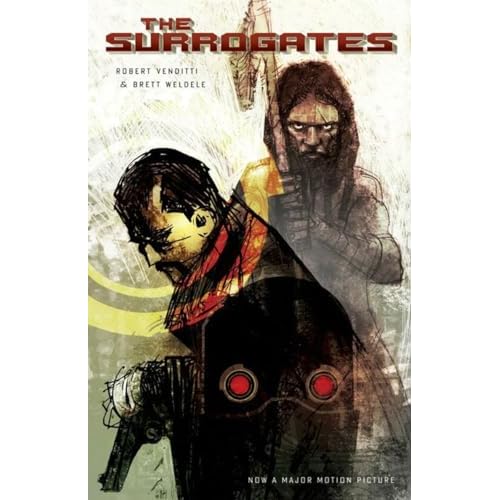
The Surrogates
by Robert Venditti & Brett Weldele


I don't think I was the only person who was surprised when Top Shelf first announced The Surrogates. Over the last decade or so the company has made its reputation with creator-driven, primarily non-genre projects of a similar bent to those of Fantagraphics and Drawn & Quarterly (albeit with a slightly more earthy focus than either of those estimable companies). Even if you allow for occasional departures, The Surrogates is, on the face of it, still much more in line with what you'd expect from a "new mainstream" company like Oni or AiT / Planet Lar.

After reading the book, I still don't know how The Surrogates fits in with the wider spectrum of Top Shelf releases -- save to say that, like much of the company's output, the book is very good. Good science-fiction is exceedingly rare in comics, for a few reasons. Much of what presents itself as sci-fi is either superhero stores in drag, fantasy stories with sci-fi pretensions, or straight action-adventure with sci-fi trappings. Anyone looking for decent examples of contemporary hard sci-fi or speculative fiction in the medium is pretty much on their own, with a few notable exceptions. The Surrogates doesn't quite escape these problems: there is, as you might expect from a quick glance at the cover, a kind of costumed adventure around whom the book revolves. But Steeplejack is less a character than a presence: he kicks the plot into gear, manipulating events from a distance while remaining an figure of enigma. Much like V in V For Vendetta, the character is less a character than a motivation, an idea personified and converted into a catalyst through action. Unlike V, he doesn't speechify, leaving the characters around him to assume his motivations after the fact. It's an interesting choice, one that invites the reader to make his own decisions about the chracters' morality and motivations.

If anything, I'd say The Surrogates is far too short. The one thing the book does unmistakably well is to create the context of a real and believable sci-fi world in which the characters interact and situations occur. World-building is one of the most important aspects of sci-fi, and once you get past the initial high concept (robot "surrogates" controlled by remote allow people to live, work and play while remaining within the comfortable confines of their homes) Venditti and Weldele's world is a plausible one. If anything, it's too plausible: the necessary focus of a scant five-issue miniseries is just nowhere near enough to give anything but the briefest sketch of the most fascinating aspects of this "Brave New World".

The ostensible plot -- kicked into motion when Steeplejack begins killing surrogate robots and burgling expensive prototype computer chips -- is really only a sideshow on the way to explicating this larger world. The mystery of Steeplejack's identity isn't even really a mystery: the perpetrator isn't introduced until after the book is half over, at which point they're the only serious suspect. Perhaps with more space Venditti could have spent more time elaborating on the kind of elaborate Chinatown-esque layers of political and social complacency which are only barely hinted at here. In the end (and unsurprisingly), the only real "villain" is the corporation that manufactures the surrogates. While great pains are taken to show the unavoidable benefits of the surrogate presence in society, the inevitable downside of dehumanized interactions and anti-social reliance on proxies is unavoidable. Regardless of the occasionally cursory nature of the plot*, the story's true focus remains firmly on these human dimensions. It is to Venditti's credit that the reader actually wants to stick around, to see the plot play out at greater length and with added depth, such is the world he has created.

As I said, sci-fi is hard work, and it's pretty impressive to reflect on the fact that The Surrogates is actually Venditti's first graphic novel. Despite the flabby plot in the book's second half, this is really an assured debut. He nails the characters and the setting, and in sci-fi those are the two most difficult landings. It would be tempting to blame some of the book's abruptness on the format. As I said, this could easily have been a lot longer. But perhaps its better to err on the side of caution your first time out the gate?

I was initially leery of Weldele's work -- he's got one of those slightly abstract, elaborately designed styles that brings to mind Ashley Wood. But there are only a couple of places where the book suffers from a lack of clarity, and only inasmuch as there are a couple of fairly complex action setpieces that require a bit of work to digest properly. As is pretty much standard for an artist of this type, I am anxious to see where Weldele's style takes him in the future, once his influences become a bit less pronounced and a more individualized perspective becomes clear.

Despite some qualifications on the book's construction, I wholeheartedly enjoyed The Surrogates. There's been a lot of care put into the book's presentation and preparation, with ample bonus materials adding to a substantive reading experience. For a journeyman work this shows a great deal of promise for both Venditti & Weldele, and on its own merits it is still one of the better sci-fi books I've read in years.


*My question is, how does Steeplejack generate the gigantic EM pulse at the book's climax? Don't you need a dish or a tower or something with which to generate that kind of energy?

Saturday, December 09, 2006

Positive Affirmations

Friday, December 08, 2006

Wednesday, December 06, 2006

Science Is Fun

OK, pop quiz: who can tell me what is wrong with
this panel from Superman / Batman #30?

Answer: Superman / Batman sucks ass.

(Click to enlarge.)

Leave your answer in the comments.
First correct answer gets a kewpie doll!

Tuesday, December 05, 2006


Guy Gardner: Collateral Damage #1 (of 2)
by Howard Chaykin with Michelle Madsen


(I can't be the only person who saw this book in the store and accidentally read that credit as Michael Madsen, can I? My initial thought was, wow, this book couldn't be any more manly if it tried.)

Just in case anyone thinks I had it in for Chaykin after my Hawkgirl post the other day, I thought I'd take a moment to point out that I took a special trip to the store to get his new Guy Gardner book. There's a sentence I didn't ever see myself typing: I can't even remember the last time I bought a Green Lantern book, let alone a book with Guy Gardner in it. Probably one of those Giffen / DeMatteis "I Can't Believe It's Not The Justice League" books or something.

Anyway, the character couldn't be a better fit for the creator. Although he is perhaps best known for his creator-owned work, Chaykin is one of a surprisingly prestigious group of creators (Dave Gibbons is another) who retains a fondness for the Green Lantern franchise. Guy Gardner may be pretty much the definition of a B- or even C-list character, the kind of hero with a definite fanbase but no real commercial presence, an established brand that nonetheless presents a slew of opportunities for a distinctive creator like Chaykin, the kind of opportunities that simply would not be on the table for a larger character.

I was surprised by how closely Chaykin tied this book to DC continuity. Sure, there's no real specific timetable, but it is technically a tie-in to last year's Rann / Thanagar War. Also, Guy's Vuldarian origin is a major plot point: this is the kind of niggling continuity wrinkle that you would easily expect a brand-name creator like Chaykin to ignore, and yet he places it front and center as a motivation for the main villains. (Does guy still have those weird "Warrior" powers, or did he lose them when he got his ring back? And whatever happened to the yellow ring he was using for a few years?)

In any event, Collateral Damage allows Chaykin the opportunity to remold Guy in his own image, or, rather, the image of one his stock characters -- the not-so-lovable cad, the abrasive rake. Usually the idea of the "ladies man" is played for laughs in superhero comics (as we see in much of Guy's history), because most superhero books simply don't have the vocabulary to deal with this character type in a realistic-seeming manner. Chaykin presents Guy in a far less comedic context. Here, Guy is that dude we all know, the total asshole who acts like a lecherous creep and practically abuses every woman he meets and yet somehow gets laid a lot more than you or I -- basically, this is who we all sort of knew Guy was along along (if we cared to think about it), but never really saw because of the restrictions of the Comics Code. This slight reinvention of Guy fits Chaykin's customary brusque tone like a glove.

Although he's obviously got a fondness for the genre, I don't really know how well-suited Chaykin's style is for space opera. Chaykin's style is always notable for the attention payed to bold layouts, with prominent figures placed against semi-realistic backdrops. Chaykin's characters usually look bigger than those of just about any artist -- he has a way of placing the human figure front and center in just such a way as to make even the least interesting set-ups seem dynamic. Perhaps as such it is less suited for showing the context of vast expanses of interstellar space?

In any event, this book seems far more suited to Chaykin's style than most of his recent work-for-hire exercises. It probably has something to do with the fact that this is the first book out of his recent prolific patch that he's written as well as drawn, the first to my recollection* since Vertigo's Mighty Love OGN. The methodical precision with which Chaykin lays out every element of the story, building an accumulation of events in such a way that the plot builds itself almost imperceptibly, is simply a joy to behold, the kind of patient craftsmanship that you don't often see in the realms of mainstream comics. (He has, however, developed an odd tendency to draw his women with lantern jaws, hardly an attractive feature in a femme fatale.)

The only question I have is, who the heck would ever seek out Guy Gardner to negotiate a cease-fire? I have to believe there is a reason why they would pick the least peaceable super-hero in the universe (besides Lobo) to sit down for treaty talks. Chaykin's not stupid enough to put an element like this in there without examining the logical implications -- five'll get you ten there's a sharp twist somewhere in the second issue relating to just that. Guy is too much of a consummate egotist to see the incongruity, but to anyone else paying attention it can't help but seem like a weird plot point.


*Although I am reminded in the comments that he did indeed releases a Challengers of the Unknown mini last year, which I don't think I ever read.

Thursday, November 30, 2006


Are We Feeling Safe?


I only wish there were a thousand cartoonists like Keith Knight . . .

There aren't many political cartoonists of any persuasion who can afford to be as tirelessly provocative. Knight seems to have found some modicum of success while remaining independent for just that reason - he is independent. If you go to his website and look, his strips are being syndicated in a remarkably low number of venues. I am certain that each paper or website represents something of a personal commitment on the author's part.


It took a while but Aaron McGruder finally figured out that there were more effective venues for harsh political commentary than the comics page. I don't blame him at all for leaving newspapers: there was always going to be resistance to an "Angry Black" voice in Everytown, USA; without even so much as the friendly, deceptively rounded exterior of the very caucasian Doonesbury to hide behind, Huey Freeman was always going to be a hard sell*. It's difficult not to see Knight, and like-minded fellow-travellers like Ted Rall and Ruben Bolling, as slightly Quixotic figures, fighting hard to get a liberal perspective heard in mainstream outlets. It's not so much that conservatives have a lock on the cartooning arts (they obviously don't), but the centrist perspective is so hardwired into all but the most adventurous editors and news institutions that anyone tilting even slighty to the left of, say, Shylock Fox, faces an uphill battle from the start.

All of this would be besides the point if the strip weren't funny, but thankfully it is. Humor depends to a large part on shock, the sudden, bracing confrontation with the unexpected that elicits laughter. Knight's best panels are can be pretty bracing: like the best political cartoonists, he doesn't seem very willing to give the world a break. Injustice and stupidity are all around us, and it takes a keen eye to not only pinpoint said injustice and stupidity in the cosmic world of politics and society, but to trace it back to its roots in the behavior of everyday people. Like McGruder, Knight's harshest invective is reserved for the short-sided and harmful behavior inside the black community, the kind of behavior that chronically hinders attempts at serious political discourse on matters of race on anything but the most piecemeal basis.


Sure, white people can be stupid and racist, but black people are stupid and racist too; the army may use predatory recruitment tactics in the face of increasing attrition, but every soldier in the Armed Forces faces needless death on a daily basis; and everyone can agree that George Bush is a moron. The reason Knight is so effective is that, unlike a good many political cartoonists (Gerry Trudeau included), you really get the idea that Knight is as mad at himself as anyone else. You get the feeling, reading a large sequence of these panels in one sitting, that Knight is fully aware of the fact that folly and tragedy are human conditions, not merely black or white or male or female, and that subjects such as racism and poverty and AIDS and war impact every single one of us. He's not excluding himself from any measure of blame. That's the message - and you can forgive Knight for the occasional didactic turn - let's every one of us get the fuck off our asses and stop being so stupid. An admirable sentiment for one and all; it would be even better if you didn't get the sinking sensation that with such a circumscribed audience he's preaching to the choir.


If I have one criticism, it's that Knight is a strong cartoonist who appears to be purposefully hobbling himself. It looks as if he draws with a Sharpie marker and ballpoint pen - it does the job, but limits his vocabulary. I can see what he's going for, but I can't help thinking that he wouldn't become a vastly more interesting cartoonist - as opposed to polemisict - if he started working with a brush. All you need to do is look at James Kochalka's early work compared to his current work. In the beginning Kochalka was famously anti-craft, and his early strips reflected this primitivist ethos. Once he started using the brush, however, he gained a much firmer control over his work - he didn't become a different artist, he merely became a more focused and elegant artist. Elegance isn't really Knight's bag, but I'd still like to see what he could do if he gave himself the opportunity.


*Not so on late-night cable. It took a few episodes to hit its stride, but the Boondocks cartoon is already a far superior vehicle for McGruder's political commentary than the strip ever was or ever could be. In a perfect world the "Return of the King" episode would win an Emmy.

Wednesday, November 29, 2006


Seven Sons
by Alexander Grecian & Riley Rossmo


I should preface this review by pointing out that I have essentially no interest in repurposed fables or fairy tales. For some people, I know, finding historical lineages and modern parallels for ancient stories is simply an irresistible pastime. I don't have a lot of patience for allegory, period, and the layer of metaphor and legend that accumulates around fairy stories is, for myself and I suspect to most, simply an obfuscating fog of historical detritus - as opposed to some romantic historical-literary saga*.

So I am perhaps the last person who should be reviewing Seven Sons . . . but, I am willing to put aside my personal prejudices in the name of criticism. As the text piece at the back of the book makes abundantly clear, Seven Sons is something of a labor of love for writer Grecian: a retelling of a favorite story from his childhood, built from extensive study of the tale's history and varying incarnations. In choosing to place the Chinese fable in a western context, and specifically that of an actual western (as in, horses and guns and such), Grecian is consciously placing the facts of the country's racist history into the foreground of his story. The seven Chinese brothers are here presented as expatriates, living abroad during the time of the Taiping Rebellion, having fled the Asian turmoil for the quieter but no less dangerous shores of California during the mid-century Gold Rush (an event that all California children must learn about extensively**).

The problem is that the western historical subtext really doesn't add anything to the story itself. As presented, the miners and settlers during the California Gold Rush are very racist, yes, but selectively so, according to the needs of the story. This pinpoints one of the basic problems with the book: as is often the case with retellings or "updatings" of classic fables, the story itself becomes little more than an elaborate pageant, less a logical series or events or character-defined actions than a procession of things which occur for no reason other than that they must occur. So we've got seven brothers who each possess a different fantastic power, and in a certain situation each power is presented as exactly the antidote to the problem at hand at that specific moment - the man who can stretch is unsuccessfully hung, the man who cannot burn is trapped within a burning house, etc. Perhaps this would work in a straight fable or a childrens' book (apparently it has for hundreds of years), but by stretching the core concept to fit into a novel historical setting, the authors strain credibility - the specificity of the historic setting works to directly contradict the supposed "mythic" connotations of the repurposed fairy story. By combining different approaches, the actual finished product possesses all of the weaknesses inherent in the approach, but none of the strengths.

Riley Rossmo's art is interesting, but he is still struggling under the weight of a number of influences. The most obvious of these would be Ashley Wood (himself influenced by Sienkiewicz***). But the kind of stories Ashley Wood draws are very specifically suited to his extravagant style. Here, Rossmo's elaborate presentation - mixing what appears to be uninked pencils with bold swathes of black and various muted graytones - seems too ostentatious for the actual story on display. This kind of presentation is best for design-heavy, more laconic storytelling, not necessarily concise action storytelling. The heavily-stylized design work overwhelms the story, to the point where often it is difficult to follow the progression of events. That is not to say there aren't some striking setpieces - but you can't tell a story simply by leapfrogging from setpiece to setpiece.

I could go on****, but ultimately it will suffice to say I am not the intended audience for this book. I supposed there is a large audience who will probably be able to accept the trappings of the genre with a lot more ease than myself - I just don't care for fairy tales.


*I have so far escaped entirely unscathed from the Fables phenomenon, save for a free copy of a recent overprinting of the first issue slipped into my bag by a friendly comic shop owner - not impressed.

**When I was a kid I had to participate in this massive historical pageant in fourth grade. It paid a little bit of lip service to all the mountains of dead indians killed in the 19th century by western encroachment; little or no mention of the thousands of abused Chinese workers who built the railroads, except to give them credit for participating in the grand experiment of American nationalism - yay Manifest Destiny! And boy, what few crumbs they did throw to the Indians - "paleface is coming with iron horse!" Jeezum Crow.

***Who was in turn influenced by Adams, who had been influenced by Kirby - it all comes back to Kirby in the end.

****Why, for instance, are they shown in kung-fu poses on the cover? None of them do any kung-fu at any point within the story! And the "surprise" next-to-last page twist - if you didn't see it coming on page eight I've got a bridge in Brooklyn I'd like to sell you . . .

Tuesday, November 28, 2006

My Humps


There's something I've been wanting to rant about for a while now.

I believe it was Mark Evanier who once observed that an artist should never draw a naked woman unless they've actually at some point, you know, seen an actual naked woman. It's a good rule of thumb, I believe, but the problem is that there are so many gross inaccuracies inflicted on the female figure by male comic artists on a weekly basis that it's almost impossible to begin to parse where the institutionalized sexism ends and where overt titillation begins.

Howard Chaykin is an artist to whom I will extend the benefit of the doubt in assuming that he has indeed seen a naked woman once or twice in his life. Chaykin's work is famously sexualized, but somehow it never seems dishonest or particularly exploitive (except, of course, when it is purposefully meant to be exploitive in the context of a story). Of all the people who've worked regularly in mainstream comics the past few decades, he seems to be one of the few who actually understands sex as more than a theoretical pastime. What a concept!

That said, he's recently committed a singularly weird faux pas, a hideous gaffe that I can only imagine was intentional. I speak, of course, of Hawkgirl's breasts, one of the most bizarre running visual gags to his comics these past few years.

Now, it's accepted that Hawkgirl, like many superheroines, has an above-average bustline. OK, fine. But - there are ways to draw large breasts and ways not to draw large breasts. Dirk Deppey coined the term "boob sock" for good reason: many (male) comic artist seem to think that all women's blouses automatically conform to the shape of the individual breast, forming a kind of "sock", giving the impression of something that has been painted on rather than an item clothing that drapes across the figure in a semi-naturalistic fashion.


See this woman here, modeling the nice sky blue ("French Kiss") New Balance T-shirt for the JC Penny catalog? Notice how that works? Even something relatively form-fitting still obscures part of the breast, because the fabric is pulled across the body in such a way as to not necessarily obscure the chest, but hardly defining every curve, either.

OK, that's Exhibit A. Exhibit B is what you would expect a woman participating in regular athletic activity to wear, a sports bra:


See what's that's doing? Supporting and confining. Because when you're running around, flying above the city, spearing ancient demons and wrestling with Kite Man, you really want to be supported. Especially if, say, you've got a larger than average cup size.

Assume your average superheroine is wearing tight form-fitting spandex. The "boob sock" phenomenon is actually less likely to occur with spandex, because the material stretches more than, say, cotton or wool. So while it can still accentuate the chest, you don't see a lot of cleavage. In fact, tight fabrics tend to support and confine - which is one reason why a lot of athletic wear is made out of spandex.


Now let's take a look at Chaykin's Hawkgirl:


It would appear based on the evidence on this picture that Hawkgirl's breasts, in addition to being unnaturally round, in addition to having preternaturally erect nipples, are also independently leaping up and away from her body in opposite directions.


This is where our good friends at the Scheudenfreud Clearinghouse, AKA Awful Plastic Surgery, come in handy. It would seem, rather than merely presenting an elevated and unrealistic idealization of the feminine form, Hawkgirl has actually been the victim of a bad boob job.


Hey! It's Hawkgirl! Er, no, it's some random model I found when I typed "bad boob job" into Google's image search.


But I can see how you might have trouble telling the difference...

It's long been accepted as the norm that superheroines have large busts - so much so that every time a woman in comics was presented with anything less than a C-cup, it was practically a news item. Hawkgirl, in both her comics and cartoon incarnations, has usually been drawn with semi-rational sized breasts.


This is a picture of Hawkgirl drawn just last year. Notice the normal breasts? Relatively well-proportioned?

I wonder if 52 will show the part where Hawkgirl goes to the hospital for saline implants, because obviously One Year Later her breasts were much bigger.

Monday, November 27, 2006


Rock Bottom
Joe Casey & Charlie Adlard


For a while now Joe Casey has been quietly building a career as one of the most versatile writers in comics. It probably helps that he never reached the level of popularity that circumscribed the careers of many of his peers. He's written a few popular comics but many unpopular ones as well. This has enabled him to settle into a satisfying career as a dependable mid-list writer, highly respected but by no means a marquee attraction. Thus even when he's writing books like Avengers and Fantastic Four he can still devote a sizable amount of effort towards independent work. I can't begin to speculate which is more fulfilling, but just the fact that he continues to hoe parallel fields when he could easily have abandoned publishers like AiT/Planet Lar for (no doubt) greener pastures speaks volumes. So many creators of similar stature seem to be more concerned with signing exclusivity deals than producing more personal work - not my place to castigate anyone for the kind of work they choose to pursue, but as a consumer and a critic it is still slightly disappointing that careers like Casey's are more and more a rarity*.

Rock Bottom is, at least on the surface, a familiar story: the idea of a man turning or being turned into rock has a long pedigree in comics, all the way back to the Thing and it, The Living Colossus and Concrete (although, of those three, you can probably guess which one is least fondly remembered - hint: it's the same one who got crushed to powder by the Hulk). The volume at hand tackles the question, albeit from a different angle: whereas the Thing and Concrete are essentially forced to make their peace with their conditions, living lives that have been fundamentally altered by their transformations, the protagonist of Rock Bottom is faced with a slightly more pressing predicament. Thomas Dare wakes up one day to discover that he is slowly turning to stone. There's no cure for this condition. It can only be fatal.

Dare hasn't lived a particularly good life. He is filled with regrets and surrounded by loose ends. As the end comes, he is given cause to reflect on his own fatherless upbringing, and how his situation - both medical and moral - reflects that of his long-dead father. How much of a person's life is dictated by their heritage? Of course, this would be a wonderful opportunity for Dare to rise above his own limitations, to use his final days to become something better - but Casey resists the temptation, for the most part, to wrap the story in some kind of redemptive arc. The "message", as such, is far less upbeat, but in its own way more reassuring: regardless of the ways they live their lives, the casual cruelty and neglect with which they inflict each other, people still contain the potential for kindness. Reality is often messy, filled with ambiguities and uncertainties - but at least we contain the potential to rise above our circumstances if given the opportunity.

For the most part, Casey succeeds by remaining close to the proverbial ground. There are no cosmic explanations or weird plot twists, this is essentially the story of a man in his final days, attempting to face an inevitable end with some modicum of dignity. Dare isn't a saint and he leaves life with more than his share of regrets. Casey overreaches in the book's final act, pushing for a far more cosmic resolution than the story perhaps called for. Undoubtedly the ending is much more in line with how such events would actually play out in the "real" world, but ultimately it's more than a little unsatisfying to see Dare's story subsumed by the demands of ostensible reality. Thankfully the last few pages regain the book's equanimity, allowing Dare and the reader to leave with something resembling grace.

Although he's been one of the industry's best-kept secrets for quite some time already, Charlie Adlard's work here represents perhaps the best of his career. Like most all AiT/ Planet Lar books, Rock Bottom is presented in black & white - interestingly, Adlard has chosen to work exclusively in fine ink lines, with a line so even and unvaried that it could have been produced by a technical pen. There is no cross-hatching, no spotted blacks, just black lines on white paper - with the sole exception of the creeping graytones of Dare's petrification. It's a pretty ballsy move, considering everything that could have gone wrong: a black & white page relies on balance and contrast much more so than a color page, and unvarying line weights can blend together without the leavening influence of color. To his credit the composition is never anything less than crystalline in clarity. The effect is peculiarly clinical, framing Dare's story in as unsentimental a context as possible.

This is not a happy story or even a very sympathetic story, but regardless of a few extraneous detours it is most importantly a surpassingly human story. It is definitely significant achievement for all involved, and a resounding rssponse to any who had written off the publisher after recent setbacks.


*Props to Peter David and Brian Michael Bendis, however - two of the most mainstream of mainstream writers, both of whom have also pointedly kept their toes in creator-owned work. The opportunities are there for those who seek to pursue them.

Thursday, November 23, 2006

The Crossover You Demanded


Thanks to the tireless research of Mr. Mike Sterling, we can finally catch a glimpse of the single greatest crossover of all time:

Tuesday, November 21, 2006

So...


No one got the joke yesterday? Come on, people. It wasn't that obscure a reference. I'd been dying to use it for ages.


So you don't think this is a totally wasted blogpost:

Wednesday, November 15, 2006

No One Likes You, Please Die


One of the things about reading superhero comics for any amount of time is that you get pretty comfortable with a lot of second-rate, slipshod ideas that might seem laughable in any other context. A man with a magic ring who flies around the universe and takes orders from blue midgets in bathrobes? Great, let's make it the cornerstone of our fictional cosmology. A dude who gets to hobnob with the most powerful superheroes in the universe simply because he's good at shooting arrows? Wonderful, let's do it twice, and then recycle the idea a dozen times more.

Getting into the slightly loopy logic of superhero comics is what allows you to enjoy them. There have been a lot of good stories written about exposing these absurd notions to the harsh light of day. But really, when you get down to it, you're missing something if you can't "get" why a man who supposedly fights brutal street crime in dark alleys on a nightly basis while wearing all white with a giant billowing cape and vision-obstructing hood is, at least on some level, a fun idea. There's nothing wrong with that -- I don't like soap operas or Laurell K. Hamilton either, but more power to those who do.

But then, every superhero fan can also point to a few characters that cross this line. It's a different line for every fan, as you might imagine -- I know for a fact that some people think the idea of a naked man covered in silver riding around the cosmos on a surfboard is the height of silliness. As has been discussed, I have a lot of problems accepting Batman as a given -- but at the end of the day I can still enjoy a Batman story if I've a mind to do so. But there are a few characters who I simply can't stand, in any capacity. Not, mind you, characters like Turner D. Century or Dial H for H.E.R.O., characters so bad they're good, or even Diablo, the character so bad even Stan Lee hated him (but who never seems to go away). No, I mean characters for whom every single element, from their creation to their concept to their execution, is simply horrid. Characters for whom, try as you might, it is impossible to find one redeeming characteristic.

Quite by accident, the other day I realized just who my own nadir was. He's not a character you see much anymore (thank God), or even a character with any recognizable fanbase at all. And yet, for who-knows-why, he's also a character who gets trotted out every few years in some misguided attempt to update an idea that was abominable to begin with. The only -- and I mean only -- possible redeeming feature this character possesses is that his first appearances were drawn by the great Gil Kane.

I speak, of course, of Morbius the Living Vampire.


Don't ask me why, I couldn't for the life of me tell you. There's just something about the combination of bad ideas that creates, in my mind, a perfect storm of repellent lameness. Dr. Michael Morbius, a "Nobel Prize-winning biochemist" is afflicted with a rare blood disease that leads him to experiment with a radical cure involving a serum derived from vampire bats. Instead of curing himself, however, he becomes a strange "living vampire", forced to drink the blood of regular people. Somehow along the way his skin turned chalk-white, his eyes turned red and his nose became flat like a pug dog.

Just the sight of Morbius on a comic book cover makes me not want to buy said comic book. All Morbius ever does is whine -- whine about his condition, about his dead wife, about only drinking the blood of the innocent, blah blah fucking blah. He made his first appearance in the infamous story where Spider-Man had six arms -- yeah, if you've not read it, you're not missing much, Kane art aside. He later got a serial in Adventure Into Fear, which featured some bizarre science fiction shenanigans. Later on he was revamped as part of the Midnight Sons promotion -- ugh. He even returned, if I recall correctly, during Howard Mackie's dire last few years on the Spider-Man books -- thank God, if I read these at any point I don't remember them.


Morbius is unspeakably lame. To know him is to loathe him.


Look deep in your heart and you will know this to be true.


My idea for a "Fifty-State Initiative": we burn every Morbius comic in the country, state by state.

Thursday, November 09, 2006

Monument Valley Hubris


It has been suggested in some quarters that, following the tentative election results of this Tuesday as well as the resignation of the Sec. of Defense, I should redact my previous pessimistic outlook. I am not going to do it, because now that the Democrats have supposedly "won" the elections, things look bleaker than ever.

I am reminded of nothing so much as the Road Runner and the Coyote. The Road Runner liked to play with the Coyote, allowing the Coyote to feel as if he had the upper hand, allowing the Coyote to believe that whatever new ACME death trap the Coyote had devised was indeed going to succeed in crushing the elusive bird. And every single time, the Road Runner slipped out of the trap in just such a way that the Coyote was clobbered by his own device -- hoisted upon his own petard, as it were, only in this case the petard was usually a four-hundred-ton atomic-powered magnet designed to drop gigantic boulders from southwestern mesas.

If you can't get the metaphor, the Republicans are the Road Runner, and in place of the Coyote we have the hapless Democrats ready to assume the burdens of power. What the Democratic party needs now is discipline, focus, strength of character, resolve, tactical aggression and strategic patience. None of which have ever been particularly popular values for Democratic politicians to possess. Where is the Tip O'Neill rising up from the ranks to ride herd over an unruly mass of agitated liberals? Nancy Pelosi? If you listen closely you can hear the President's whisper echoing softly across the Texas prairie -- "Meep meep."

In a way, it would have been better if the status quo had remained -- at least then we wouldn't all be worried about just when the other shoe was going to drop, and what it was going to be. The Republicans have this amazing way of making it look like they're on the retreat, when really, the Democrats are really just chasing their collective tails. Every concession made by the Republicans is simply just a tactical gaslight, lulling us into a false sense of security. When all is said and done, it's George W. Bush who shall have the last laugh, because he always does. The Democrats will end up hanging themselves -- it's only a question of how much rope.

Tuesday, November 07, 2006

Lots O' Thots


So I wonder if your average comic fan, having grown up on Claremont's X-Men and Claremont and Miller's Wolverine throughout the 1980s, upon encountering the samurai films which Akira Kurasawa made with Toshiro Mifune (especially Yojimbo and Sanjuro), would have exclaimed, "wow, that Mifune guy is a total rip-off of Wolverine!"


Did Marvel ever sue MF Doom for appropriating so much of their artwork for his early albums? I really wish I had picked up Operation: Doomsday when I had the chance. I was living in the Bay Area when ti was first released in 1999, and if I had bought the first indie printing I'd probably be able to get a pretty penny for it on eBay.


But yeah, if he didn't at least get a cease & desist letter at some point, well, he was extremely lucky.


Speaking of Dr. Doom, just how bad is that new Fantastic Four cartoon? Bad enough to scar small children, if you ask me. I have a pretty high tolerance for bad cartoons - I'd much rather watch a mediocre cartoon than a pretty good-to-decent live-action show if we're talking pointless TV watching. But against all odds they have produced a Fantastic Four cartoon even uglier and less appealing than that Spider-Man abomination that ran on MTV a couple years back. This isn't just mindlessly mediocre, it's the Bataan Death March of television cartoons.

The whole thing looks like it's saturated with some sort of nausea-inducing glow. Everyone has ugly haircuts. The voice acting is about what you might expect from a junior high production of Caligula. The Thing has a big "4" spray painted across his chest for no reason I can tell.

And, of course, the Thing is huge, which is one of my biggest pet peeves for pretty much every comics artist to come along since John Byrne. The Thing is not huge, he is slightly shorter than Reed, for heavens' sake. That's why him going up against the Hulk is such an effective image: it should be obvious from the art that the Hulk is bigger and stronger, but the Thing steps up anyway. When the Thing and the Hulk are both roughly the same size, the whole dynamic is shot all to hell, because the reader (or viewer) has no reason to believe that the Thing isn't as strong as the Hulk . . .

Oh well, maybe it's just me.


How the heck did they let Jim Lee get behind on not one book, but two? That takes a special type of talent. I have to wonder why we haven't seen a new issue of All Star Batman & Robin in forever -- did the toxic word of mouth force the creators to step back? Or perhaps they both have so many irons in the fire that they can't be bothered to produce what is inarguably one of the top-selling comics in the country, regardless of the negative buzz?


Why does Heidi MadDonald's photo on the masthead of The Beat look like she's just about to attack someone? It's always struck me as a particularly menacing picture, like the kind of "mug shot" you'd see on the back of some really angry punk rock album. I don't know if the image Heidi wants to project is that of an angry ferret.

On the other hand, I still chuckle whenever I see the masthead illustration for Spurgeon's Comics Reporter. That's pretty much exactly how I envision evenings around the Spurgeon dinner table.

Dirk needs a masthead with some kind of fun picture in it. Perhaps he should hold a contest?


OOOOOOOH, the McRib is back. It's odd how something so totally disgusting can at the same time be so appealing. This is why I will probably never actually become a vegetarian.

Sunday, November 05, 2006

Politics As Usual


Every political conversation I've had recently has centered on the near ubiquitous presupposition that it's not a question of whether the Democrats will win on Tuesday, but by how big a margin they will win. Although I wish I could share in the partisan enthusiasm, I have no real choice but to remain skeptical.

The Republicans are like Cobra Commander. Now matter how conclusively you think you've got them on the run, they still manage to slip away to fight another day. Time and time again history has proven that Democratic gains will always prove ephemeral, while the Republicans will always retain their lock on the hearts and minds of American voters. Said voters retain an almost comical ability to overlook the hypocrisies seemingly hardwired into the modern Conservative mindset, while holding the Democrats to an impossible double standard. I maintain that regardless of the polls, regardless of the mood, regardless of every shred of anecdotal evidence on display, every single vote the Democrats need will still be a hard-fought battle.

It wouldn't matter if the President was facing a 2% approval rating and indictment for child rape; it would matter if effigies of every senior Republican legislator were being burned in the nation's capitol; it wouldn't matter if we were living under martial law in a new-fascist dictatorship. It wouldn't matter if the Republicans were openly advocating forced euthanasia for little baby kittens and panda bears. A Republican defeat still entails a Democratic victory, and that is impossible.

Hendrik Hertzberg put it well, writing this week in The New Yorker:
In a normal democracy, given the state of public opinion and the record of the incumbent government, it would be taken for granted that come next Tuesday the ruling party would be turned out. But, for reasons that have less to do with the wizardry of Karl Rove than with the structural biases of America’s electoral machinery, Democrats enter every race carrying a bag of sand. The Senate’s fifty-five Republicans represent fewer Americans than do its forty-five Democrats. On the House side, Democratic candidates have won a higher proportion of the average district vote than Republicans in four of the five biennial elections since 1994, but—thanks to a combination of gerrymandering and demo-graphics—Republicans remain in the majority. To win back the House, Democrats need something close to a landslide.

Hertzberg goes on to finish on a slightly optimistic note, but the essential facts remain. Are the Democrats really that confident that their advantage in the polls will translate into electoral support? Really? Because, honestly, it just seems like the better the polls look now, the worse off the Democrats are going to be come Wednesday morning. (I'm already envisioning photos of incredulous, dazed and defeated Democrats running in newspapers across the country -- "Wha' happened?", jaws slack and eyes glassy.) They're quite good at snatching defeat from the jaws of victory. I'd love to be proven wrong, but history suggests otherwise.